Trickery
These two charts were used recently on the Angry Bear website to demonstrate that FDR's taxing and spending policies reduced consumption whereas Reagan's raised consumption.
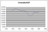 The first chart covers the 20 year period from 1930 to 1950. The second chart covers the longer period from 1980 to 2005. The impression one gets is that consumption rose dramatically in the second period. But look closer. (Click on a chart to increase its size).
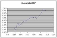 The vertical scale on the first chart runs from 0% to 90% while the vertical scale on the second chart runs from 61% to 71%. If the two charts were merged into one the rise in consumption from 1975 to 2005 would appear to be almost nothing.
posted by Borborygme at 6:59 PM
![]()


0 Comments:
Post a Comment
<< Home